The possibilities of using Tableau for a deeper analysis of your Salesforce system.
It's disheartening to see senior executives communicate disappointment with Salesforce. No one should be disappointed with Salesforce. The tens of thousands of people drinking the Dreamforce Kool-Aid each year cannot possibly all be wrong.
But sometimes, the mood is flat, and executives start freezing the expenditure on further project work. Sometimes the problem stems from a poor implementation of Salesforce - in particular where the customer has tackled the implementation in a manner at odds with the well-governed agile framework that we recommend.
There's another cause though and we've seen it show up a few times. The Salesforce implementation is reasonably well-cooked - but executives can't get their hands on adequate data to measure their business and track their KPIs.
Your first plan of attack should of course be to make sure you are getting the very best out of Salesforce Dashboards and Reports. They provide a reasonably sophisticated and flexible platform for shaping and distributing key management information.
There are however some limitations with the standard functionality, and in certain situations, this can be problematic.
For an executive management team, it is the reporting that they get to see each week. If they can't adequately track Key Performance Indicators, it can have a detrimental impact on the entire Salesforce experience. An otherwise robust and highly useful Salesforce implementation can be compromised when senior management struggles to get their hands on the lifeblood of their organisational health - INFORMATION they can use!
Here at ProQuest, we set out to find a way to deliver awesome reporting capability to Salesforce customers struggling with the standard tools. And we were conscious to keep incremental licensing costs to a minimum.
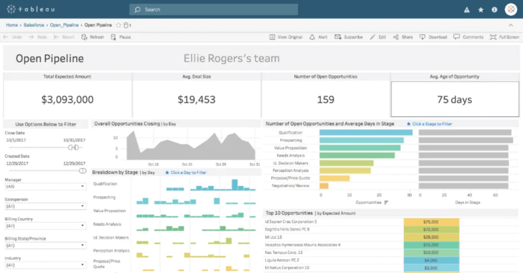
Our Solution? Tableau! As their marketing says, it's "easy to use, and easy to love".
Here are two of the main limitations we smashed in a recent project. The result is an executive team that has renewed enthusiasm for Salesforce, the need for laborious Excel manipulations has significantly reduced, and the disconnect between live data and what was moved into Excel has gone away.
Most importantly the weekly executive meeting will be served by up-to-date graphs that demonstrate the real heartbeat of the business, thus providing a platform for making it a better business. If you can measure it, you can improve it.
Here are a couple of key things we address with Tableau.
- Salesforce does not allow for Cross Object reporting. Salesforce struggles to report across multiple different objects that are seemingly unrelated. Such metrics when viewed together, can provide extremely useful information. The classic case is when trying to match lead sources with actual sales to understand where marketing should be aiming its campaigns. We have one executive team whose eyes light up when we show them lead sources mapped against actual sales mapped against actual conversion rates. In Salesforce.com, it is very difficult to pull up reports that measure how much each lead source is contributing to the sales pipeline. Instead, we used Tableau to provide sophisticated graphs to show leads/conversion rates, and actual sales all on the same page. A real opportunity to understand at a glance where marketing money is spent and to assess the worth of alternative campaign types.
- Salesforce can't report on your data unless it's recorded in Salesforce. Unless all of your data is recorded in Salesforce, you will probably need to combine data from other sources. This means that the Microsoft Excel company wizard is still busy spending Sunday evening crafting the Excel-based management reports for the Monday Executive meeting. We readily promote bringing as many processes and sources of data into the single Salesforce environment. But Rome wasn't built in a day. That's a journey. If you have a simple spreadsheet with KPI targets for your reps/regions/product managers etc there's a great way to overlay your Actual sales performance on top of your Target KPIs to show the executive team how the company is tracking.
At ProQuest we really like Tableau. It's a company on a major growth path and recognised by Gartner et al as a Data Visualisation leader. It's extremely reasonable in its entry-level pricing. Tableau includes a cloud-based server option, and it connects to your Salesforce org as a standard functionality. You can access your Tableau-created dashboards directly within your Salesforce environment.
If your Executives are unhappy with Salesforce, maybe we can help you improve things in rapid time. The power of fabulous and up-to-date Business Intelligence to the average CEO cannot be underestimated.
Contact us now to discuss your reporting challenges.